Class Notes
18/09/18.
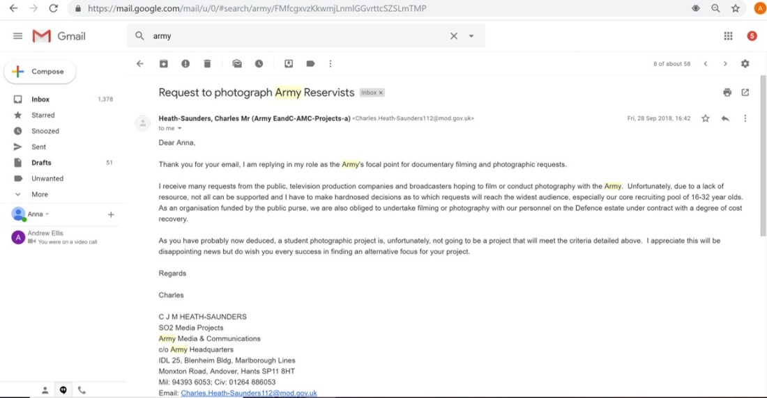
Regular critique night on Mondays. Look at Cruel and Tender book. Email the TA!!!! Army.****** Proposal in by midnight on the 3rd October. Think about football hooliganism. Good stuff goes on blog, the fuck ups go in the production notebook.
Consider: are these images sellable and who’s going to buy it? Images have got value and someone will buy your work
You can take a photograph now and it becomes a historical document when the subject is gone
New objectivity and the topography of German workers is what August Sanders focussed on
What of photography’s relationship to reality, or to truth? Is it a reliable witness? This module will ask you to consider if photography can be truly objective.
Grieson urged “the creative treatment of the actuality”. Stephen Shore’s roadtrip. SHOOT WHAT YOU KNOW – close to home
You can’t work with no commitment!!!
25/09/2018 – photobooks.
There is such a saturation of photobooks these days – think about paris photo fair. ‘the photobook is the final frontier of the undiscovered’. You have to rise above the clutter, whether that be with the photographs or the book design.
Formulaic documentary photography is photography that follows the same formula over and over again. Same set up, same time of day, shutter speed etc. might be something to consider for your book. Helps create a coherent body of work.
3 things that engage people with your people images: Interaction with the viewer, people doing things….
I’m thinking about photographing people who are normally seen in the limelight or as glamourous, but in their normal day to day lives. Send some emails out.
Constructed documentary – think about the spy photos.
****
Self Confidence Lesson
You wouldn’t be friends with someone who talks to you the way the voice in your head does. Say NO to bullying. Remove anything that doesn’t serve you
Copy the experts – the experts give dedication. Time to allow ideas to develop. And trust in the process. Translate and rewrite what your head voice is saying.
If it feels right, you’re doing the right thing. If it feels wrong, move on
Give the voice a name – something really disarming like ‘Tim’
You are not fit to judge your own work – SHARE IT
The beginnings of self-doubt start with feeling that it’s YOU that’s being judged and not your work
Don’t ever stay away from critique because you’re scared of critique
The feeling of fear is natural. What you choose to do/not to do is up to you.
Imposter syndrome is a result of growth and disappears with action.
Confidence is not a personality trait – it is a learnt behaviour
Confidence is not fixed – it changes over time
Confidence is not omnipresent – just because a person is confident in one aspect of their life doesn’t mean they have confident in all aspects
Confidence is active – it needs to be practiced otherwise it will die off
Confidence, ultimately, is the decision to try
If you’re hesitating to do something – count down from 5 and just DO IT on GO. It’s called activation energy
Don’t start or end your day dealing with other people’s rubbish – e.g. looking at social media
Photographing the Real
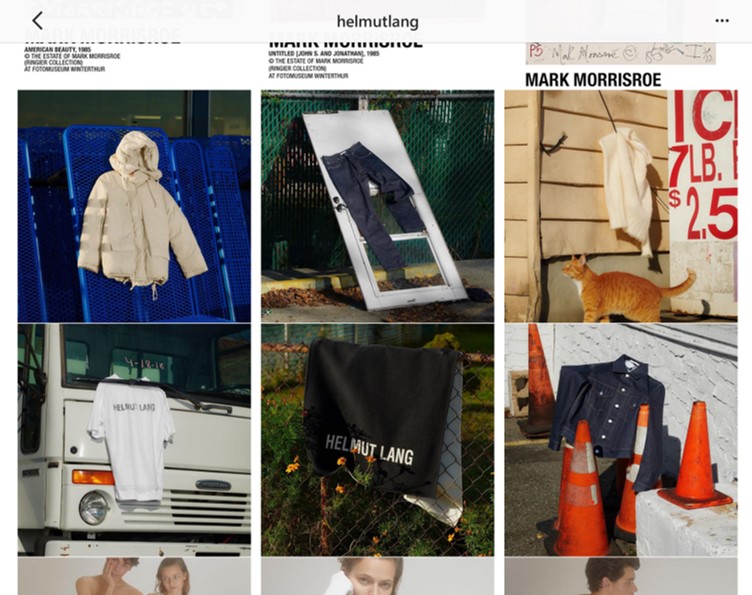
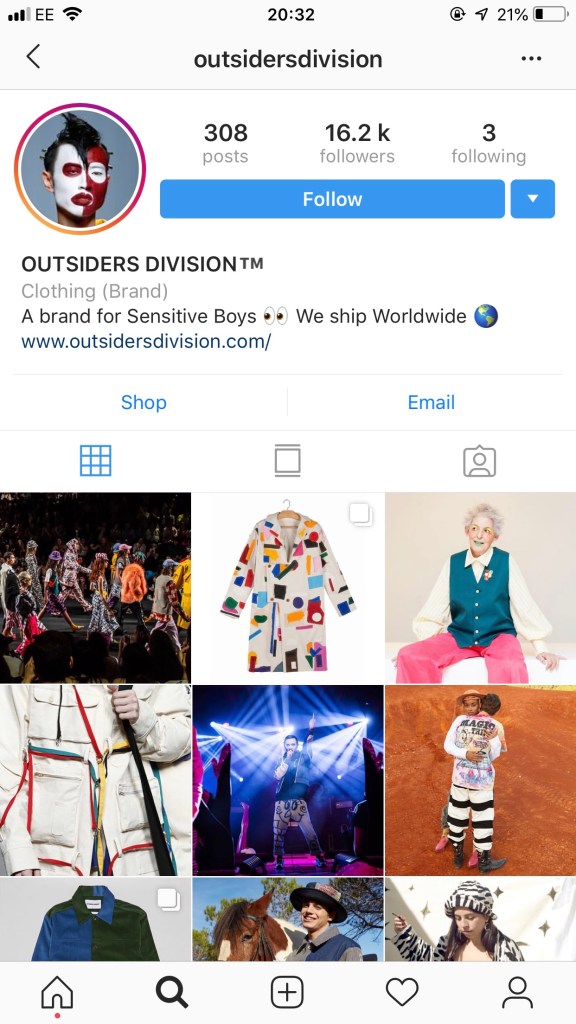
This quote by Philip-Lorca diCorcia, that it (photographing the real) is simply an ambition to record ‘that which was never really hidden, but rarely is noticed’ particularly stood out to me. I have been following a stylist and casting director on Instagram for a while now whose work I love. Her name is Charlotte James and she ‘recruits’ models for high-end clothing brands, and they’re usually people she knows. For example, she used her 86 year old ex-funeral director nan for a Helmut Lang campaign and local girls from her hometown to model Emma Brewin faux fur.


I think the reason I’m so drawn to her work and that of the photographers who capture her images is that she uses real people with real stories and gives them a platform to ‘model’ and show off their fashion which is perhaps often overlooked or unnoticed, which is what diCorcia was making reference to. It is a documentary style of fashion photography and so it is a style of documentary which prioritises aesthetics. People are drawn to different images for different reasons, and I am always drawn more to documentary photography that is full of colour or which is visually pleasing.
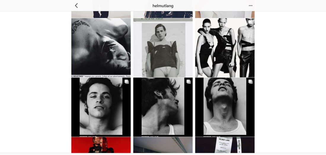
Most of James’ photographs are taken by photographers with a similar style. When I first saw her Instagram profile I thought that she was the photographer, but instead there were various photographers with different styles, such as Alex Leese, Tom Johnson, Dean Davies and Leon Mark. Alex Leese is one of my personal favourites, particularly these images:
")
")
")
")
")
These projects have inspired me to think about the elderly people who still make a huge effort with their appearances and who are massively into fashion, because in a lot of cases people stop making an effort over a certain age. I have come across these people before, in the street, in the pub, but I feel they often get overlooked. It would be great to be able to photograph older people in a way that empowers them and makes them feel as old, or as young as they feel. It is certainly a subject that I feel is ‘never really hidden, but rarely is noticed’.
Helmut Lang
Helmut Lang, one of the brands who commissions stylists like James, mixes a kind of high brow style of photography and clothing with low brow subjects and settings on their website.
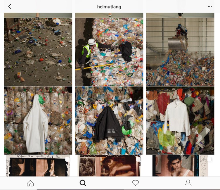
This is the sort of ‘poverty porn’ which I have a problem with as a documentary photographer. I don’t have a problem with the photographer (like Charlotte James) because she is probably not making a huge amount of wealth from her work, where as the brand will be gaining a lot of recognition through her striking and talented photographic style. This is the photographer’s reality; she is using people she knows in the places she grew up. But you could also view it from the perspective that she is exploiting her working class family in order to gain fame from working with such a high class brand. It is the juxtaposition of regular people wearing such expensive clothing which is the main attraction of the image. People who could never be able to afford these items. The image and feeling of wealth is given to them temporarily and then taken from them at the end of the shoot.
A lot of the clothes that Helmut Lang make actually look like very normal and regular clothes; actually the type of clothes that normal/ working class people would wear, but the brand’s name allows for them to sell the clothes for so much money. I don’t think they have chosen their models without a lot of consideration for the image they’re trying to create for themselves; either:
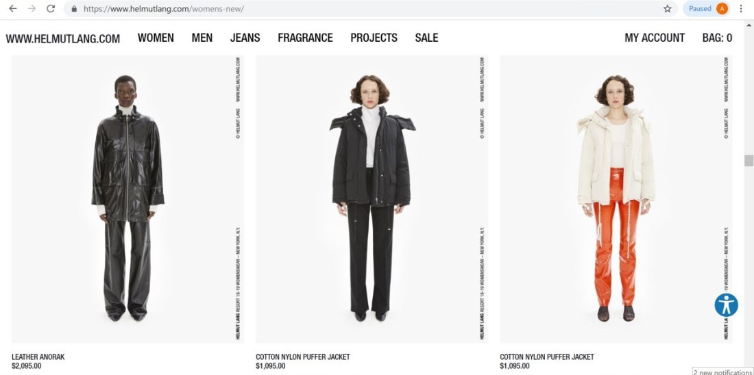
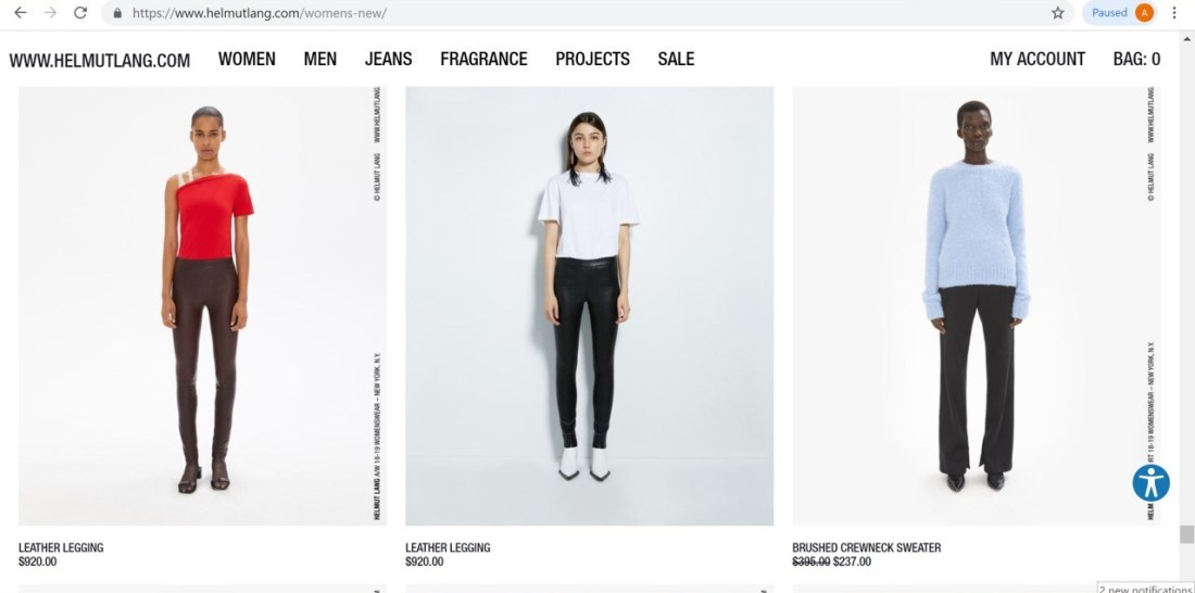
A lot of high fashion street brands these days are riding off the back of ‘chav culture’, but they wouldn’t be doing so without the demand for it being there. The whole leather-look leggings selling for nearly $1000 and nylon fake-fur trimmed winter coats are exactly what you’d find women living on council estates wearing ten years ago. The models, I feel, were also chosen to look like single mothers from the BBC’s Waterloo Road – another way they’re obviously portraying the working class. Perhaps I am overthinking it, though. It is somewhat a subjective area.
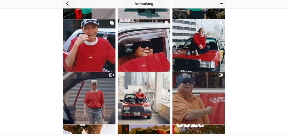
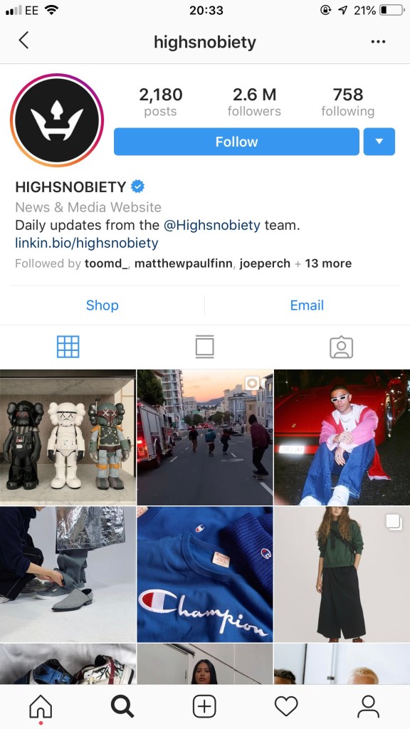
However, what I do love about this brand is that it gives a huge platform to up-and-coming photographers like James. Looking at their Instagram, if you didn’t know the brand, you’d struggle to tell if it was a photography or a fashion account. It actually brings both together, and showcases some amazing photographic work. Its half a million followers do so for that very reason. After all, fashion and photography are both great expressions of art. Helmut Lang have actually, recently, brought a range of T-shirts with documentary photographers’ work printed on them, and they also sell print of their work on their website, which again, is giving platform to emerging artists. I can only imagine how useful it would be to get featured with such a brand.
Stephen Tayo
Like Charlotte James, Stephen Tayo is another example of a talented up-and-coming photographer who uses his heritage in his high-fashion work.
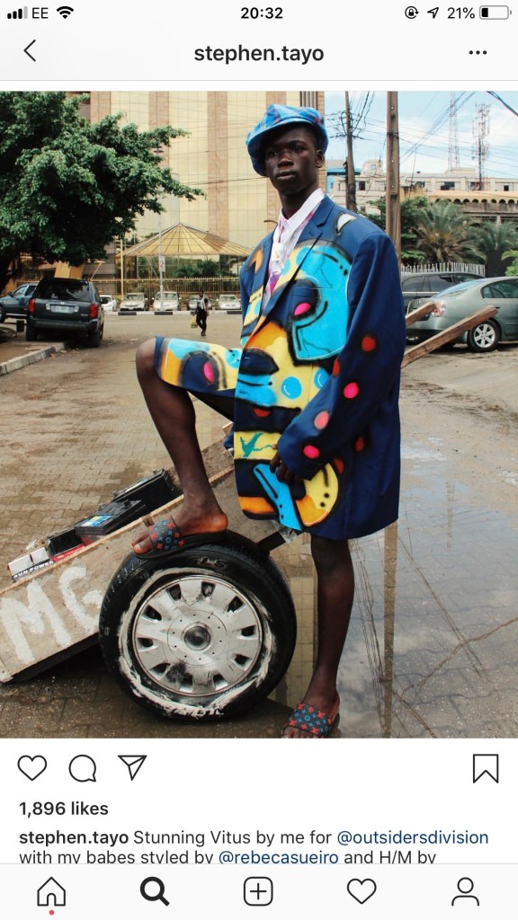
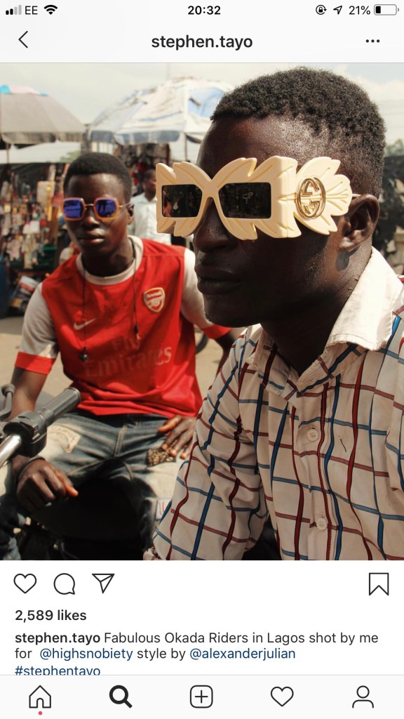
It is interesting to consider how where you come from can be integrated into your work, and to what extent it actually shapes how you create your art.
Rough Project Plan
– I would like to photograph elderly people who haven’t lost their sense of style, either on the street or at their own homes (own homes is preferable but more difficult to get access to)
OR
I would like to photograph older people in/or outside of their local pubs. It could be a statement about older people being forgotten about. A lot of older people who are lonely or widowed spend a lot of time in the pub as it is the easiest and most accessible way to connect to others. But also a lot of elderly people just go to the pubs with their friends and are actually very active and happy members of society. This is something I can explore.
Technique Research
I always find it a struggle to find information on how photographers make their images. Especially in terms of if they’ve shot on film, and what kind of camera they use. There seems to be a level of snobbery on this subject, with photographers not wanting others to know how they make their images so that nobody can easily recreate their style. Luckily for me, I have tutors and classmates who have a good eye for these things. I am personally not the best at being able to tell what technique a photographer has used, so I consulted my peers on our Facebook group.


I found out that these photographs were mostly likely taken on slide film, or colour reversal film, and using a medium or large format film camera. These things are not inaccessible to me as I can borrow a camera from university stores and buy film online, it just may be a bit impractical to create a whole book’s worth of photographs using this type of film. It is usually around £12-£15 per roll, and then £6.50 per roll to get it developed at the Darkroom. This will end up being around £20 per roll all in, and 55p per image. This will rack up quickly as I use trial and error to figure out slide film which is much less forgiving than negative film.
Development of Ideas
As suggested in our lectures, it is a good idea, in third year, to look back on old work that maybe didn’t succeed or go as planned, and revisit it. This is a time to perfect our craft. I use Instagram a lot as a public gallery, and I tend to post a lot of work on there that is somewhat experimental and one-off photographs that I just liked, and weren’t perhaps part of a series that would go on my website. So, I have been flicking back through my posts to see if there are any photographs that would inspire me to keep shooting in that way. And so, I found this photograph from January 2017 that I really liked as a one-off:
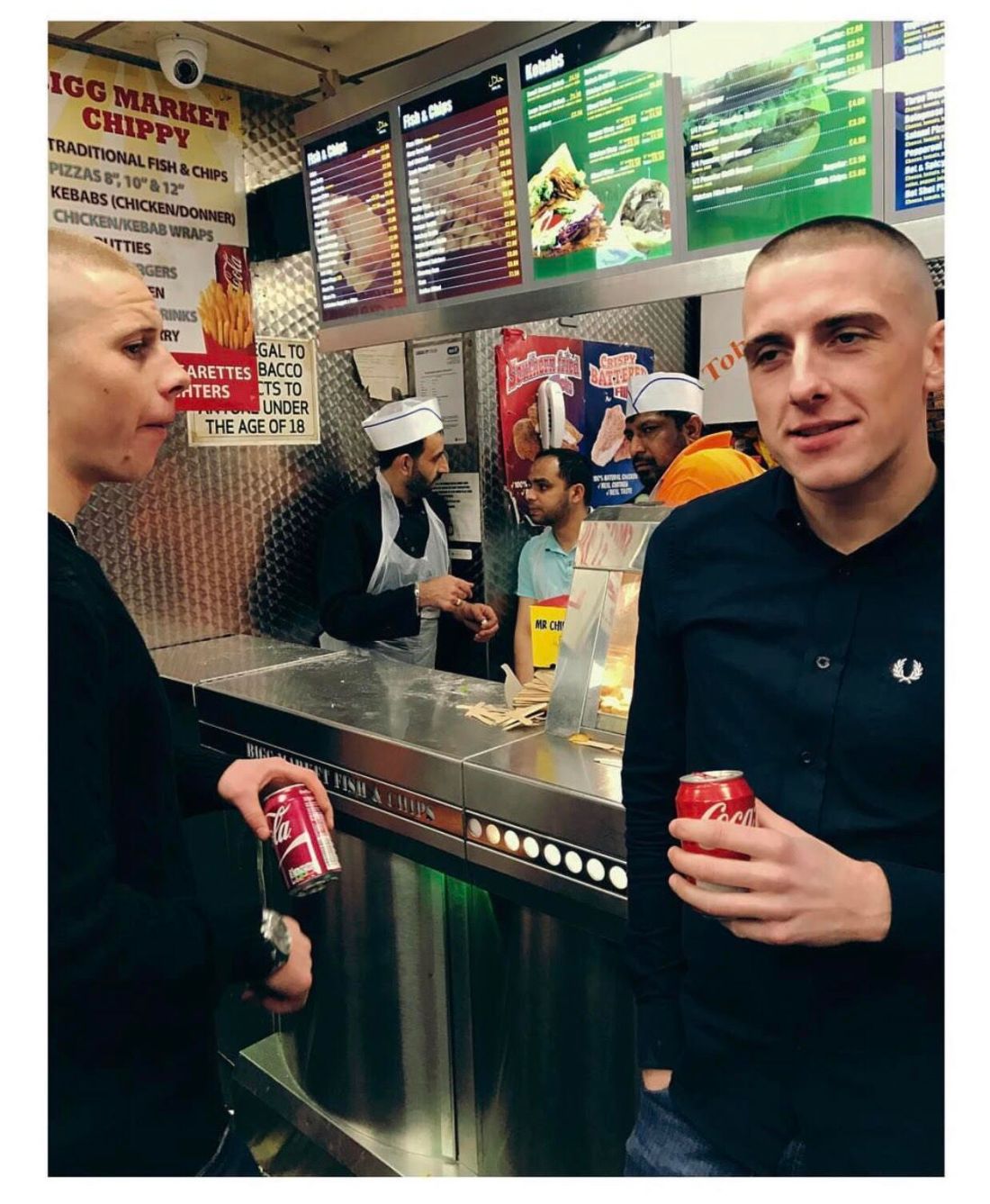
This image is particularly bad quality because it is taken from a screenshot of an Instagram post. I shot it using my iPhone 7 Plus which actually has a really good quality camera, for a phone camera. Two lenses are better than one. The biggest pro for getting an iPhone 7 Plus over an iPhone 7 is the dual 12-megapixel rear cameras. Whereas the 7 just has the one 28mm wide-angle lens, the 7 Plus has that and a 56mm telephoto lens with a f/2.8 aperture. This means that the standard iPhone lens is more like a landscape lens, and the telephoto one is more like a portrait lens.
(https://www.digitaltrends.com/mobile/iphone-7-vs-iphone-7-plus-camera/)
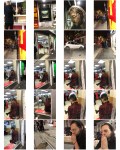
In regards to the image above, I want to create a project based on the clientele of the takeaway shops in Newcastle city centre. It will be mostly portraiture, and hopefully close-up and as raw as possible. What I am trying to capture here is the people of Newcastle as they attempt to bring themselves back down to reality. Newcastle is known as being a party city, and people come from being high as a kite (both literally and metaphorically) in the clubs, feeling on top of the world and forgetting life outside of the crowd they have put themselves in, and come to the takeaways. The contrast from the near darkness/ complimentary club lights to the illumination of the strip lighting in these takeaways is drastic and stark. Such an illumination gives those who chose a mate under the cover of darkness, to really see what they are getting themselves in for. This is not the type of scenario one would like to be photographed in, it is one of the least forgiving situations, but it allows a photographer like myself really capture the reality of nightlife, in all it’s harsh glory. This is capturing the transition from a higher state of being to normal life.
That image I took was after a night out, around 3am, when the takeaway shops on a Friday and Saturday night are packed full.
Planning
I am going to have to plan this shoot very carefully, because as I want to do it in Newcastle, I will have to cram a lot of shooting into 2 visits. I am going to go back for around 10 in November; I was planning on going back for a weekend anyway for my dad’s birthday but I have extended it. I have booked to go from Tuesday 13th November to Sunday 25th November, which means that I will be in Newcastle for 2 whole weekends (the busiest times for takeaways and so the best times for me to shoot). I will then be back for Christmas and New Year, which is obviously the busiest time of year for people going out and getting drunk. This will give me a couple of weekends to shoot, but also times during the week like Christmas Eve, Boxing Day, New Year’s Eve and New Year’s day, which are also huge days for the industry.
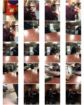
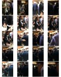
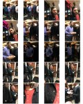
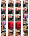
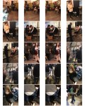
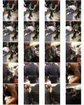
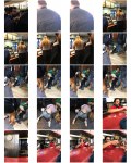
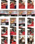
November Shooting
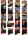
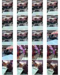
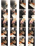
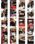
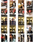
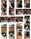
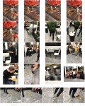
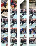
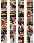
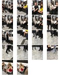
These contact sheets are from a number of different shoots I did in the 10 days I was home. I tried doing a shoot while I was on a night out myself; but found that I wasn’t trying hard enough (or was a little too drunk) to frame the photos well. I initially thought this was a good idea because I wouldn’t have any nerves, and because I would generally go to a takeaway after the club anyways, I wouldn’t feel out of place. But this didn’t produce the best photographs I could achieve. So, the next time I went to shoot, I went totally sober and by myself, which made me pretty nervous. However, I actually ended up feeling more comfortable because I went at 11.30pm rather than 3am, and everyone was much more oblivious to me than I had imagined they would be. I simply went into a bunch of different takeaways, got a can of pop, sat in the corner and observed what was going on around me. This gave me time to see people come and go, and I was much more aware of good shots. When the midnight ‘after pub’ rush had gone, I went to meet my friend in a club, then left again at 3am to take photos at the ‘after club’ rush. The ‘after pub’ rush tended to be people of middle age, and the clientele of the ‘after club’ rush tended to be in their twenties. Noticing this meant that I could get an equal proportion of the younger and older population in my photographs.
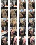
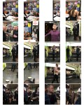
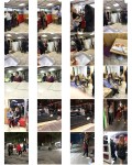
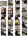
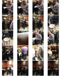
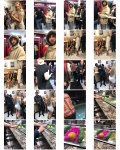
I experimented with taking photographs of people both indoors and out on the street, but decided I didn’t have enough outdoors pictures to make it worth putting them in, as only having a few would throw off the aesthetic. For example, these two images I liked but didn’t fit with the ‘look’ of the other images; it seemed as if it broke up the narrative somewhat:


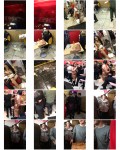
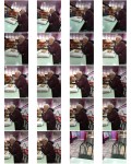
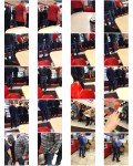
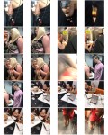
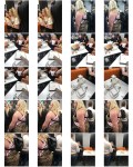
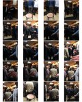
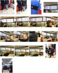
December Shooting
Book Design
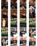
I have been thinking up some ways to enhance these images; I want to make them really eye-catching and in a way, ugly. The interiors of the takeaways are so bright and kitsch, and I want to continue that theme with my book design.


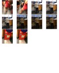
Here, I have tried to match the border colours with a shade of colour in the photograph, so there is at least one element that is cohesive and not so chaotic. I had to fiddle around with some of them, because some images just seemed more appropriate with a certain colour, like these, both shades are in the image but the red, to me, seemed more aesthetically pleasing:


I can’t quite put my finger on why; but perhaps it is because the red is a bolder colour, and these are especially bold characters.
Because I am using my telephone camera for this shoot, I used a phone app called ‘Afterlight’ to create these borders and just used my eye to choose the correct shade. I did this because it’s really simple and I was only playing around with designs in order to get feedback from my colleagues and tutors. If I were to go ahead with this design, I could use the PhotoShop dropper tool in order to be more precise and choose an exact colour from the image for the border.
I went into class with the idea in mind that I was going to create a square book with these images. The rough image I had in my head was a small paperback book, kind of like the Mr. Men & Little Miss books I used to read as a kid:


But something about this book design and the project just didn’t feel right. This is why I consulted my classmates.
My tutor suggested I get a bit more creative and collect loads of the takeaway menus from the places I took photos, mount my photographs on the menus, and then laminate them. Then I could bind them in a ringbinder. I thought it would be suitable to try and find one of those ringbinders that they use for menus in cheap Italian and Indian restaurants; the ones that are designed to look like leather, like this:
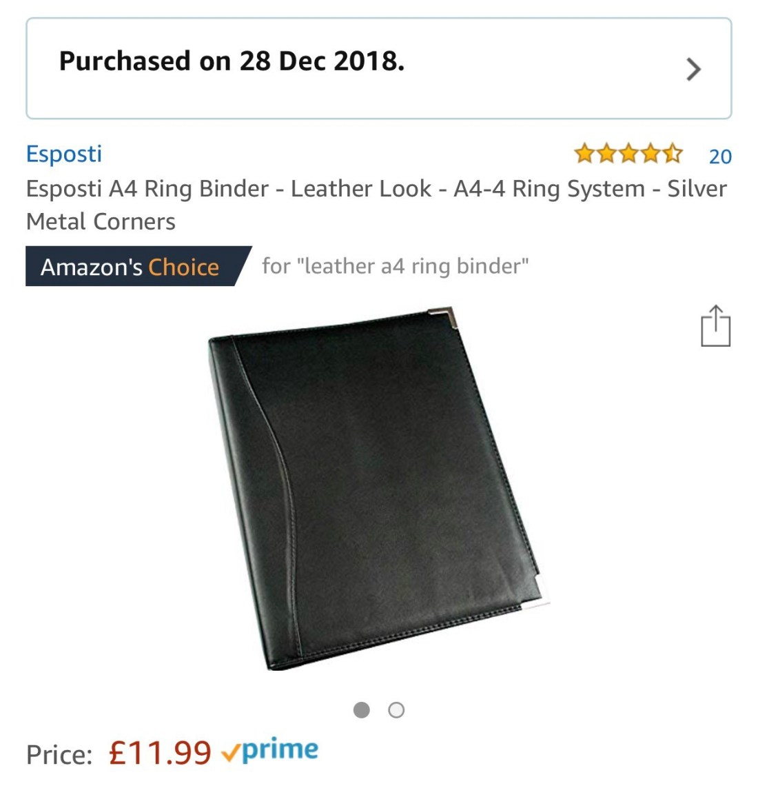
In order to construct this type of book, it would make most sense for me to laminate my own work rather than paying someone at a shop to do it for me. I would want it done a very specific way and it may not turn out how I want it if somebody else does it. So, I used Amazon again to purchase an A4 personal laminator and laminating pouches.
Guy Martin – The Parallel State
The idea of using the takeaway menus stuck with me so much because I love the idea of combining found things with photographs. It reminded me of The Parallel State by Guy Martin. For five years, Martin photographed Turkish soap opera sets and how they were being used as ‘soft power tools’, and simultaneously documented the rising tension within the political protests of 2013.
In the preorder of this book, the books come a dust cover which is a replica of a randomly selected vintage Turkish movie poster. It is this sort of combination of art or graphics with personal photographic work really resonated with me, as I love the more creative approaches to documentary photography rather than the classic and straightforward approaches.
I cannot post pictures of the book here because the images are copyrighted, but it can be seen through this link here:
https://www.theparallelstate.com/signed-book-only
Editing Photos
I managed to collect around 30 takeaway menus from in and around Newcastle city centre just from going in and asking. I did try to make a Facebook post asking if people who live in the suburbs could give me the takeaway menus that they get through the door, because I don’t live in the city, but to no avail. This meant that the menus I collected were not necessarily in keeping with my kebab shop/ late night pizza shop theme. I had to go into Indian and Chinese takeaway restaurants, and I think it is quite obvious in some instances that my photographs don’t fit with the takeaway menu I have put them with. In an ideal world, I would have kept all of the menus as the cheesy graphic ones that you only really find in pizza and kebab shops, but practically, I could not get enough of these to fill my book. There are a lot of these types of shops in Newcastle, but the type of shops that I shot in are only open for the night out-goers, so late night places, and they don’t need to have menus because their only target audience is the people who frequent the bars and clubs and come in drunk afterwards. So it was impossible to get menus from the exact takeaways anyways. Part of me wanted to be able to collect an equal amount of different kinds of cuisine menus, but I think with having the majority as pizza and kebab shops and then the odd fish and chip shop, Lebanese and Chinese menus, it was an accurate representation of the ratio of pizza and kebab shops compared to comparatively few other cuisines in the city. What I mean is, there are quite a few variations of different cuisines, but there are a huge amount of pizza and kebab shops that they kind of overshadow the others.
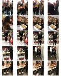
Anyways, in trying to create a cohesive narrative, it was a process of visiting and re-visiting the timeline 4 or 5 times, because each time I came back and looked at it with fresh eyes, a different order or combination of photos and menus made more sense. I had to simultaneously decide on a menu that seemed to match a photo in colour, but also one which didn’t make the combination too distracting. At the same time I was trying to create a narrative that told the story of chaos and the vulgarity of reality. These are some of the pairs I thought worked well as diptychs, both in colour and narrative:


One thing I do regret with the construction of this book is not centring all of the images. What I did was; place it in a certain place on the menu so it framed or outlined specific words or graphics; but I think in the end this was a mistake.
Some images which didn’t really sit well with others, but which I thought were bold enough to stand alone were these:


There were certain menus and graphics that I wanted to be on display in the book, so I organised the pages in the file in such a way that they had as much attention as the photographs.
